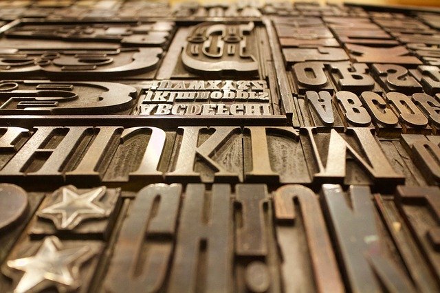
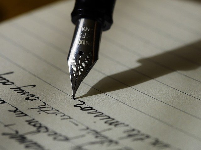
Typography is an art that dates back hundreds of years, since even before Johannes Gutenberg invented his printing press. It's the combination of typefaces, type design, paper, and ink to create an appealing way to communicate the written word. The purpose of typography is to make reading easier. The right typeface can highlight key ideas or make readers feel a certain emotion. Print typography and digital typography are built on the same basic principles, but there are a few key differences. Digital typography needs to consider how the words look while they're on the screen, including things like colour contrast and how different designs will display on different browsers or devices. Print typography focuses on how the letters will look once they're printed onto paper.
Types of Typefaces
The first distinction to make when categorizing typefaces is between serif and sans-serif fonts. A serif is the little part that sticks out at the ends of the strokes that make up the letters; a noticeable example is the little "feet" at the bottom of a capital letter T. "Sans" means "without" in French; a sans-serif font is a font that doesn't have serifs. Serif fonts, such as Times New Roman, give an air of professionalism and class, and they make large blocks of text a bit easier to read. Sans-serif fonts tend to look more modern and sleek. Typefaces can also be categorized by how much horizontal space their individual letters take up. With a proportional font, letters take up different amounts of horizontal space depending on their shape; for instance, "m" is much wider, while "l" doesn't need as much space. Monospaced fonts are the opposite of proportional fonts: In a monospaced font, each letter has the same width. While monospaced fonts tend to look like they were produced by an old typewriter, script fonts are intended to look more like they were made by a pen; script fonts' design resembles handwriting. Typefaces can also be classified by their use: Display fonts, typically more ornate or decorative-looking fonts, are ones used in headlines and other large labels.
- Different Kinds of Typography
- The Difference Between Serif and Sans-Serif Fonts
- The Effect of Typography on Readability
- Selecting Script Fonts
- The Development of the Script Font
- Fonts in Use
- German Typefaces
- French Typography History and Development
- Monospaced Fonts
- Text vs. Display Fonts
Important Terminology
Typography has its own specific and unique vocabulary to describe everything from the base between the curves of a "b" to the tiny tip of an "e". There are special characters, like that elegant "and" sign that's actually called an ampersand. There are also terms for different techniques in typography, like kerning and tracking. Kerning is adjusting the spacing between individual letters. Tracking is the adjustment of spaces between all of the letters. Even the individual parts of letters have names. The top of a letter is called the apex, for instance, and a part of a letter that hangs down below the baseline is called a descender.
- All About Typography
- Glossary of Typography Terms
- About the Ampersand
- Useful Typography Definitions
- Vertical Metrics in Typography
- Learning to Kern
- How to Track in Typography
- The Role of the Ligature
Families and Fonts
Fonts are broken up into different families. Within each family, all of the fonts share similar characteristics. Fonts in the same family can be bold, italicised, compressed, or expanded versions of each other. Popular font families include Helvetica, Times New Roman, and Palatino. Some people classify font families into Old Style fonts, French fonts, and Germanic fonts. There are also Arabic and Indic fonts. When learning about typography, it's fun to try out the different types of fonts to create the style you're looking for. Fonts are becoming a new forum for self-expression and creativity. Once you know the terminology and design principles of fonts, you'll be able to confidently make your own art through typography. Remember that not all languages use English characters: When creating a bilingual poster, it can be important to choose a font that works for multiple languages.
- History of Typographical Families
- All About Transitional Typefaces
- Type Families
- Slab Serif Fonts
- Humanist Typefaces
- The Helvetica Font Family
- Times New Roman Font Family
- Arabic Fonts
- Creating Your Own Font
- Seven Tips for Selecting the Right Font
More Resources
- WhatFontIs: Identify Any Font
- Incredible Types: Typography Showcase for Inspiration
- Type Connection Game: Practice Pairing Fonts
- The Society of Typographic Aficionados
- Typography Competitions
- The Typography Encyclopedia
- Typography Rules and Terminology


